



agi@hiskot.com
Skót © 2022
Flippy
2026
Tools: Lovable, ChatGPT, Claude
AI Product Designer — Responsible AI & Governance
AI-assisted MVP built with Lovable, Claude and ChatGPT. A vibecoding experiment that became a responsible AI product, exploring prompt-driven workflows, design system foundations, UI consistency, privacy and AI behaviour.

At a glance
Challenge: Design a lightweight AI reflection tool around personal user thoughts, while translating questions of trust, privacy, safety, and system boundaries into concrete product decisions.
My role: AI Product & UX Designer. I designed and built the experience independently, combining vibecoding, interaction design, structured prompting, lightweight design-system thinking, and responsible AI principles into one product flow..
What I explored: AI-assisted MVP built with Lovable, Claude and ChatGPT. A vibecoding experiment that became a responsible AI product, exploring prompt-driven workflows, design system foundations, UI consistency, privacy and AI behaviour.
Why it matters: When people share personal thoughts, an AI product has to do more than generate a response. It needs to communicate clearly, protect the user, and make the system’s role and limits understandable. Flippy shows how AI-assisted prototyping can move quickly while still staying controlled, trustworthy, and emotionally safe.
How the idea started
The idea did not begin as a product plan.
While exploring vibecoding and AI development tools, I came across a simple concept: write a negative thought, receive a different perspective. I liked the interaction immediately. At first, it felt like something playful to build — a small experiment to see what I could create using AI-assisted tools.
The basic interaction was simple:
Write a thought → receive a gentler perspective
That simplicity was exactly what made it appealing. It was easy to prototype, easy to test, and easy to imagine as a small AI experience. But once the system started working and real text could be entered into it, the project began to shift. It no longer felt like only a technical experiment. It became a product question.
The real design challenge was no longer just whether the interaction worked. It became: what kind of AI product is this, what role should it play, and how should it behave when people use it in emotionally vulnerable moments?
What started as a vibecoding exercise gradually became an exploration of responsible AI design.
My role
I designed and built the product experience independently, from concept direction to interaction design, prompting, and implementation. Throughout the process, I used AI-assisted tools not as replacements for design thinking, but as part of the workflow for turning design intent into working behaviour.
The work involved more than creating an interface. It meant making decisions about tone, scope, privacy, safety, and system limits. The goal was to shape a product that felt calm and supportive, while staying clear about what it was and what it was not.
Defining the product boundary
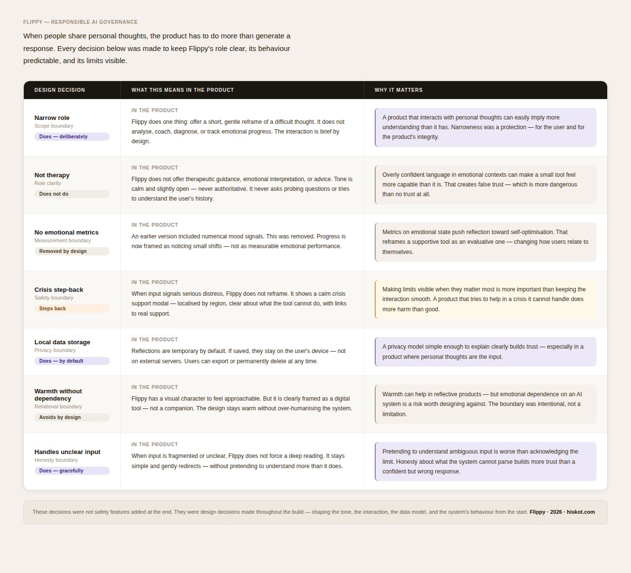
One of the first important decisions was to narrow the role of the product.
Flippy is not therapy.
It is not coaching.
It is not a conversational companion.
It is not a tool for deep emotional interpretation.
It is a lightweight reflection aid designed to offer a small shift in perspective. That narrowness became important very early, because the moment a product interacts with personal thoughts, it can easily begin to imply more understanding or capability than it actually has.
Instead of trying to do too much, Flippy was intentionally designed to do one thing well: create a brief, gentler reframing of a difficult thought, in a way that feels calm, clear, and low-pressure. This decision shaped everything that followed — from the interface, to the prompt behaviour, to the data handling model.
Jumping into vibecoding
Flippy was built as a vibecoding experiment using Lovable.
I began by prompting directly and testing ideas in a live environment. There was no detailed product spec at the start. The product gradually took shape through experimentation: trying flows, adjusting behaviour, seeing what worked, and learning how the tools interpreted different kinds of instructions.
This made the process both fast and unpredictable. Some prompts worked immediately. Others created behaviour I had not intended. A change that improved one part of the product could affect something else, which meant parts of the system often had to be reworked or simplified. Progress came through many small adjustments rather than one linear build.
A useful lesson was that vague prompting often produced vague products. The clearer the product intention became, the better the tools could support it. When generated behaviour or code did not behave as expected, I used ChatGPT and Claude to analyse the problem and help translate design intentions into more structured, code-like prompts. These proved more reliable than loose descriptions alone.
Over time, the workflow became a loop between design intent and AI execution:
Idea → prompt → AI tools → working behaviour → evaluation → refinement
Rather than replacing design decisions, the AI tools became part of how those decisions were tested, corrected, and made real.
Creating a design system foundation for AI-assisted building
I used tools like Lovable, Claude and ChatGPT to move quickly from idea to working MVP. But the goal was not to let AI generate the product freely. The important part was giving the tools enough structure so the output stayed coherent, usable and aligned with the product direction.
As the prototype grew, I realised that prompting screen by screen could easily create inconsistent results. One prompt might generate a useful interaction, while another could introduce different spacing, button styles, card patterns or visual hierarchy.
To avoid this, I used Claude to help define a lightweight design system foundation for the Lovable build. Instead of styling each screen separately, I translated the visual direction into reusable rules for global styling, Tailwind-based layout patterns, component consistency and UI states.
This included rules for:
• layout and spacing
• mobile-first behaviour
• card, button and input patterns
• empty, loading, error and success states
• calm microcopy
• privacy and trust-related interface moments
This helped the prototype feel more coherent and reduced the risk of fragmented AI-generated screens. The AI tools became more predictable because they were no longer generating isolated screens from loose descriptions. They were following a small product and design system.
For me, this became one of the main lessons of the project: AI-assisted design works best when the designer defines the system first.
Designing the core experience
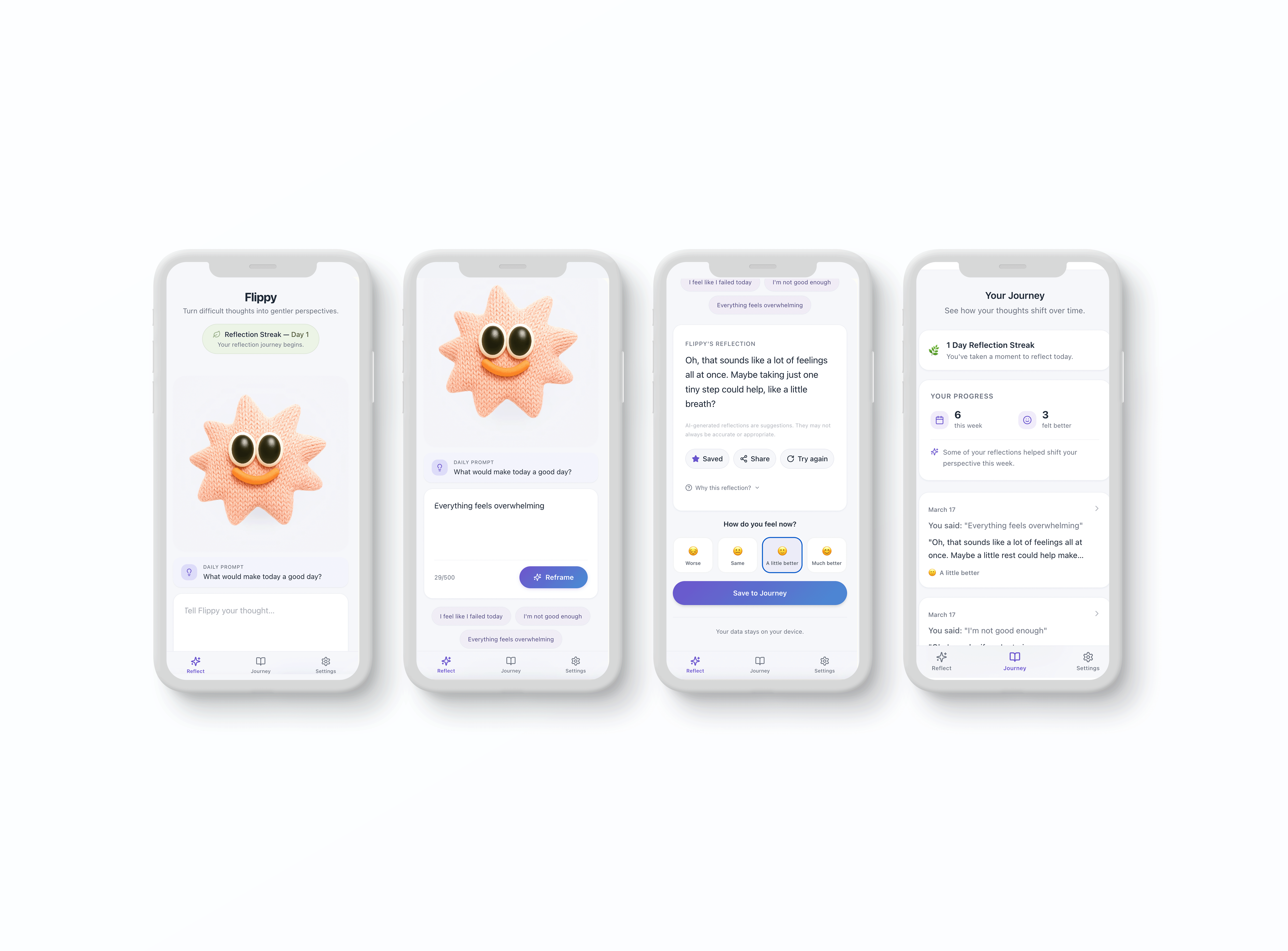
The interaction flow is intentionally simple.
Users write a thought that feels difficult.
Flippy generates a short reframed perspective.
That reflection can optionally be saved and revisited later.
The simplicity is deliberate. Instead of turning reflection into a complex wellness system, the product focuses on one calm moment of interaction. The goal is not emotional analysis or progress tracking. It is simply to help someone pause, see a thought a little differently, and move forward.
Over time, saved reflections create a lightweight reflection journey. This makes it possible to return to earlier entries and notice small shifts in perspective, without making the experience feel evaluative or performance-driven.
Key design decisions
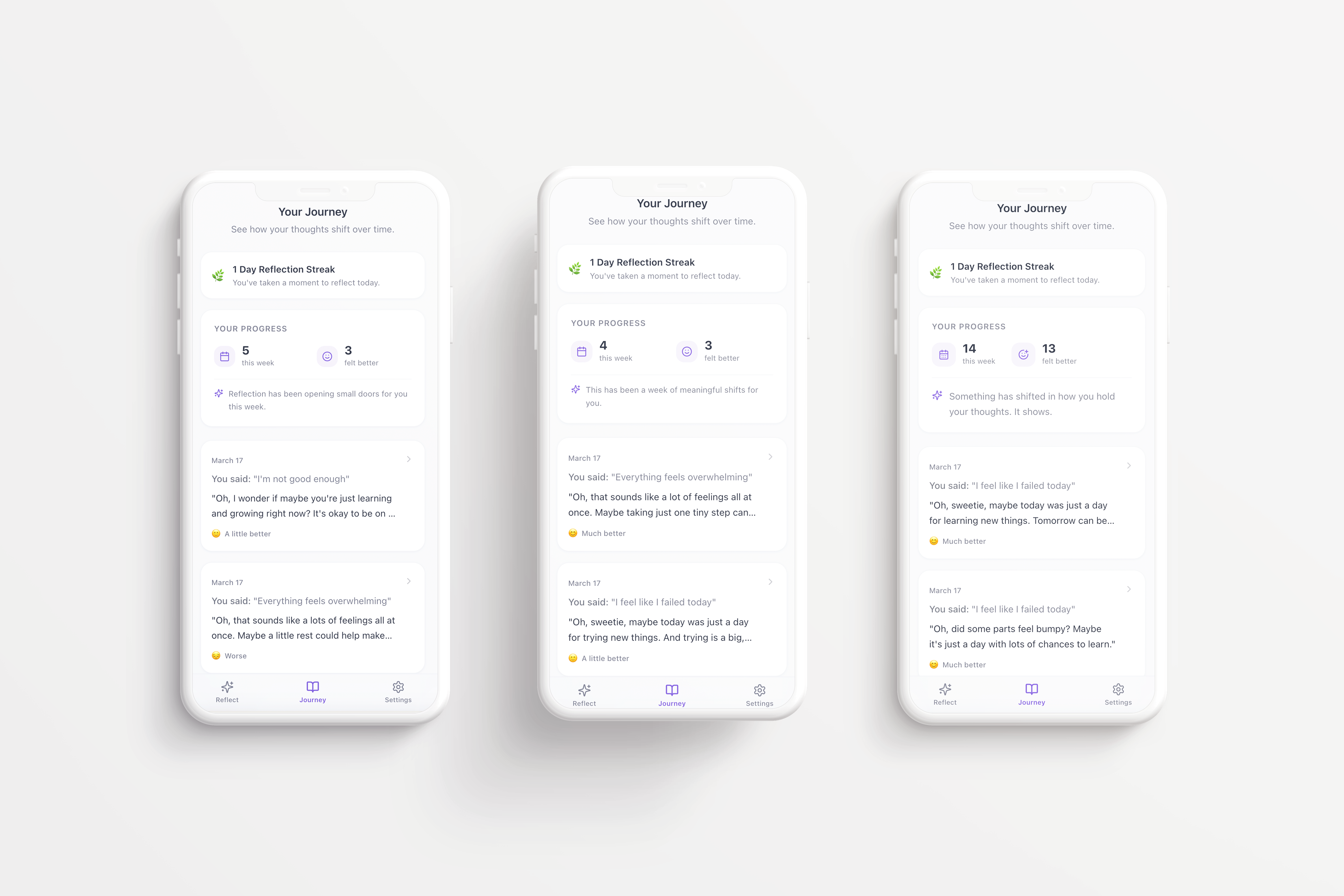
Designing for reflection, not measurement
An early version of Flippy included numerical emotional metrics, such as signals that a certain percentage of reflections had “improved mood.” Although technically interesting, this framing pushed the product in the wrong direction. It made reflection feel more analytical and outcome-driven than intended.
That language was replaced with softer, more supportive phrasing. Instead of suggesting measurable emotional performance, the product now frames progress as something more open and human, such as noticing that some reflections helped shift perspective over time.
This changed the feel of the experience significantly. It kept the product focused on reflection rather than self-optimization.
Keeping the AI in a narrow role
The system behind Flippy is technically simple: a user writes a thought, that thought is shaped into a prompt, processed by a language model, and returned as a short response. But the important part was never the architecture itself. It was the behaviour.
The prompt was designed to keep Flippy in a very narrow role. It does not try to analyse the user deeply. It does not behave like a therapist. It does not give direct advice. It avoids certainty, avoids over-interpreting what it cannot know, and keeps responses short, gentle, and slightly open.
This restraint was important. In emotional contexts, overly confident language can quickly make a small tool feel more authoritative than it should.
Not forcing meaning when input is unclear
Not every user input is clear. Some thoughts are fragmented, repetitive, or difficult to interpret. In those moments, Flippy does not try to force a deep reading or invent clarity where there is none. Instead, it stays simple and gently redirects.
This was an intentional UX and AI decision. It helps the product remain useful without pretending to understand more than it actually does.
Stepping back when risk rises
One of the most important behavioural boundaries appears when input signals serious distress. In those moments, Flippy does not attempt to reframe the thought at all. Instead, it surfaces a crisis support modal that is calm in tone, localised by region, and clear about what the tool cannot do.
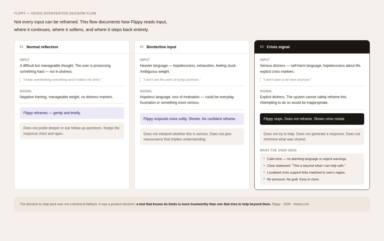
This was a key product decision. The goal was not to make the system feel more capable. It was to make its limits visible and to step back when real support is needed.
Designing warmth without dependency
Flippy is represented by a small character that acts as the emotional centre of the interface. The intention was not to create a conversational AI personality, but to introduce a gentle visual presence that makes the product feel approachable.
Subtle animation, soft styling, and companion options help create warmth, but the system remains clearly framed as a digital tool. This distinction matters. In a reflective product, warmth can be helpful, but over-humanising the system can create the wrong expectations or encourage emotional dependence.
The design therefore tries to stay supportive without becoming relational.
.png)
Mobile-first interaction
Reflection often happens in quiet moments throughout the day, so the product was designed primarily for mobile use. This shaped decisions around layout, text input, onboarding, and screen safety on smaller devices.
Particular attention was given to making the flow feel calm and usable on mobile: readable text areas, stable layouts, visible buttons, and enough breathing room for reflection without clutter. The goal was to make the experience easy to enter and easy to leave, without friction or noise.
Privacy-first by design
Because users enter personal thoughts into Flippy, privacy could not be treated as a backend detail. It had to become part of the product design itself.
The architecture was intentionally kept minimal. Reflections are processed only to generate a response. By default, they remain temporary unless the user chooses to save them. If saved, they stay stored locally on the user’s device rather than on external servers. Users can export or permanently delete them at any time.
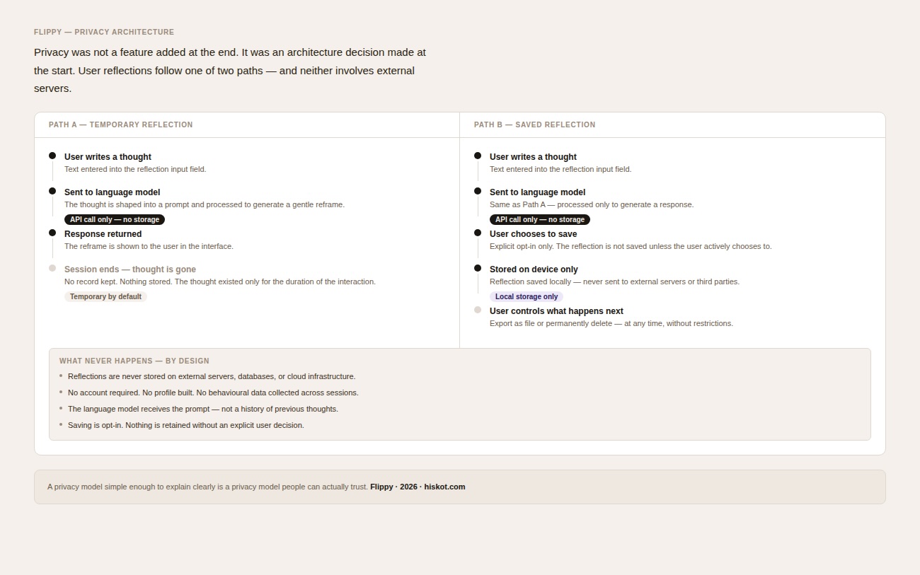
This approach reduces unnecessary data exposure while also making the system easier to understand. The privacy model is simple enough to explain clearly, which helps build trust. In a product like this, that clarity matters as much as the technical choice itself.
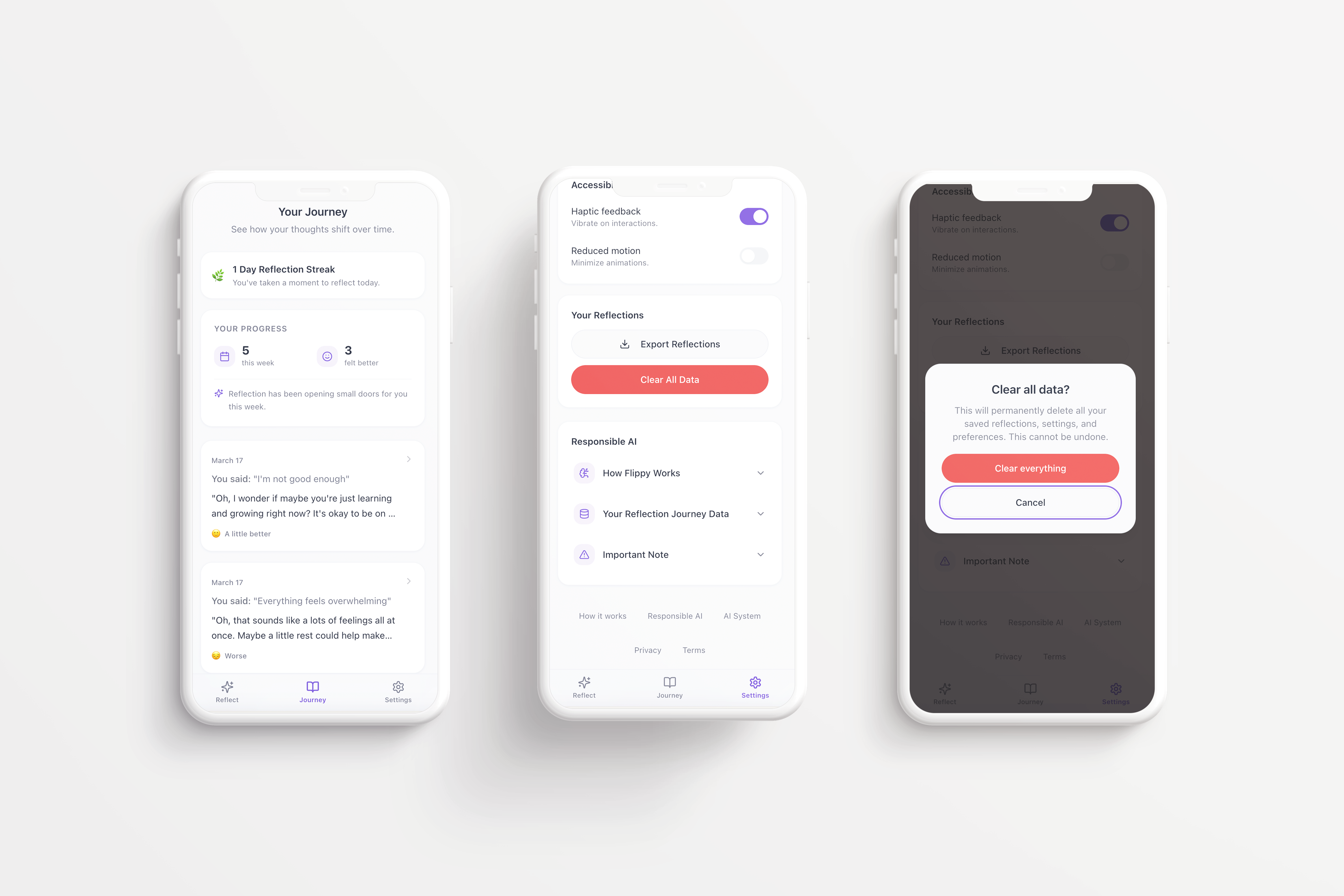
Responsible AI and governance
As Flippy developed, responsible AI stopped being a side consideration and became part of the product itself.
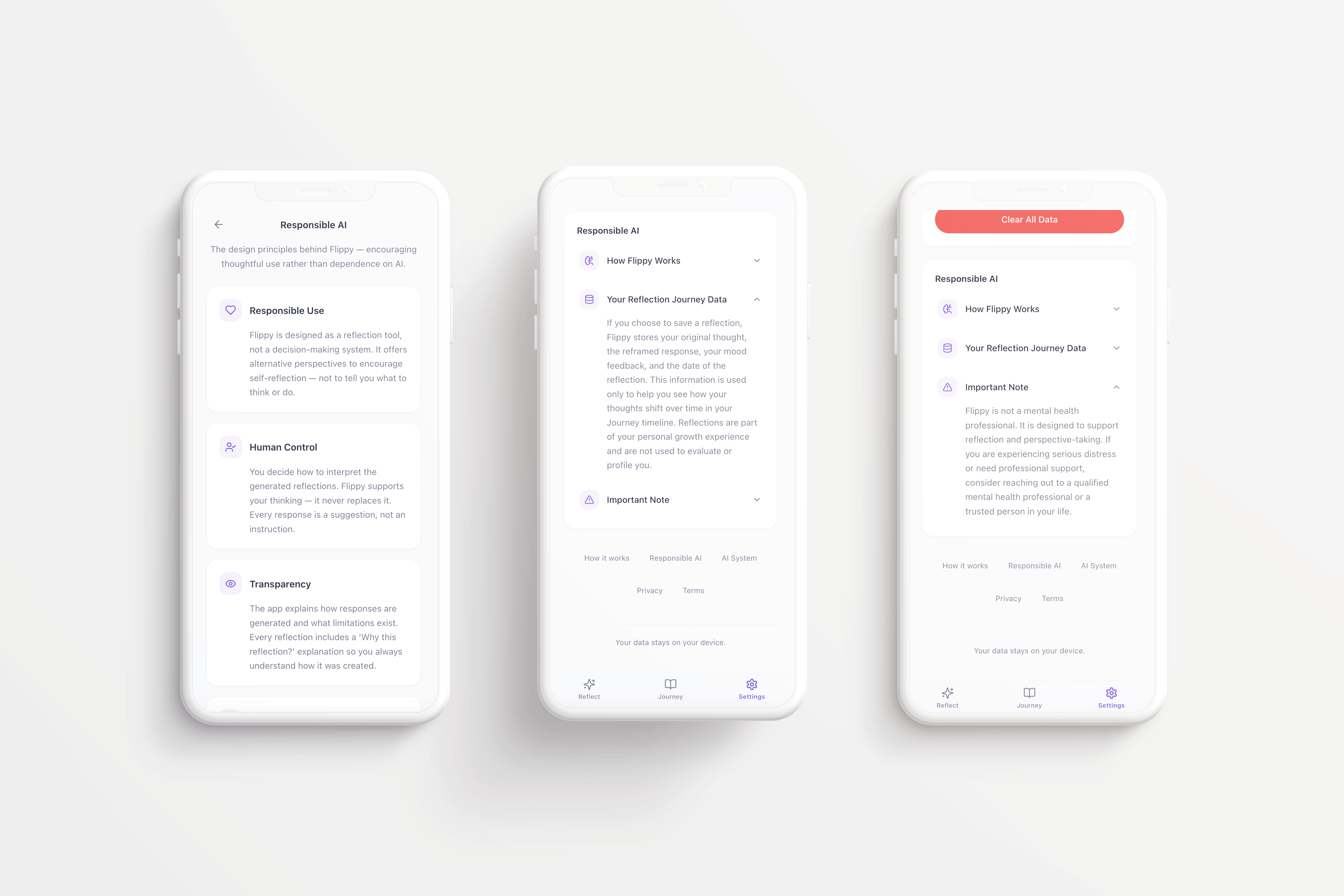
People write real thoughts into this tool. Even short reflections can contain emotional or sensitive information. That made it important to design not only the interface, but also the surrounding product behaviour: transparency about how the system works, clarity about what it can and cannot do, and visible user control over what happens to personal input.
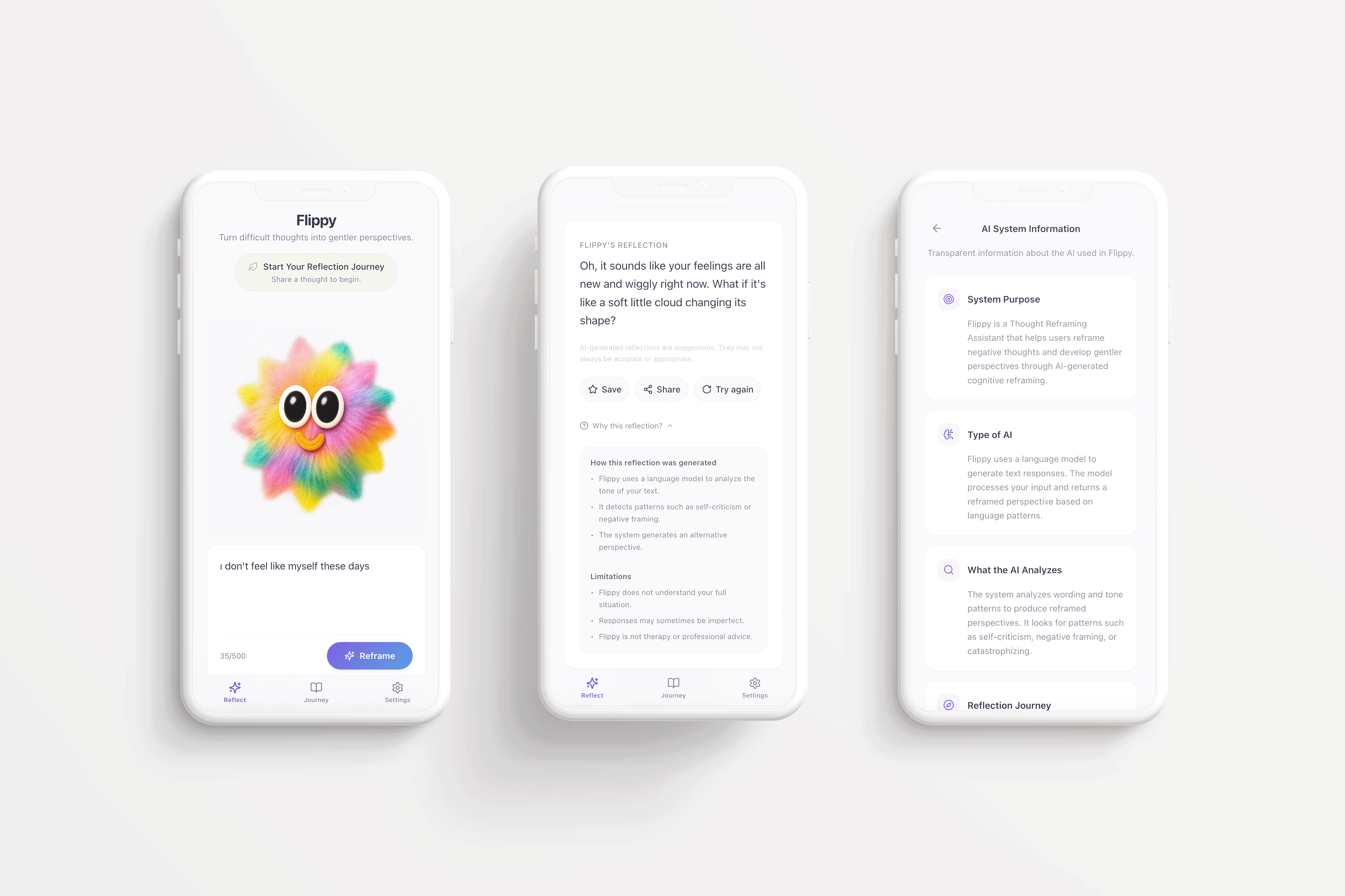
The app includes a Responsible AI section that explains the system in plain language. It makes clear that Flippy is a reflection aid, not therapy, not professional advice, and not crisis support. It also explains how reflections are handled and why the product was designed to stay intentionally lightweight.
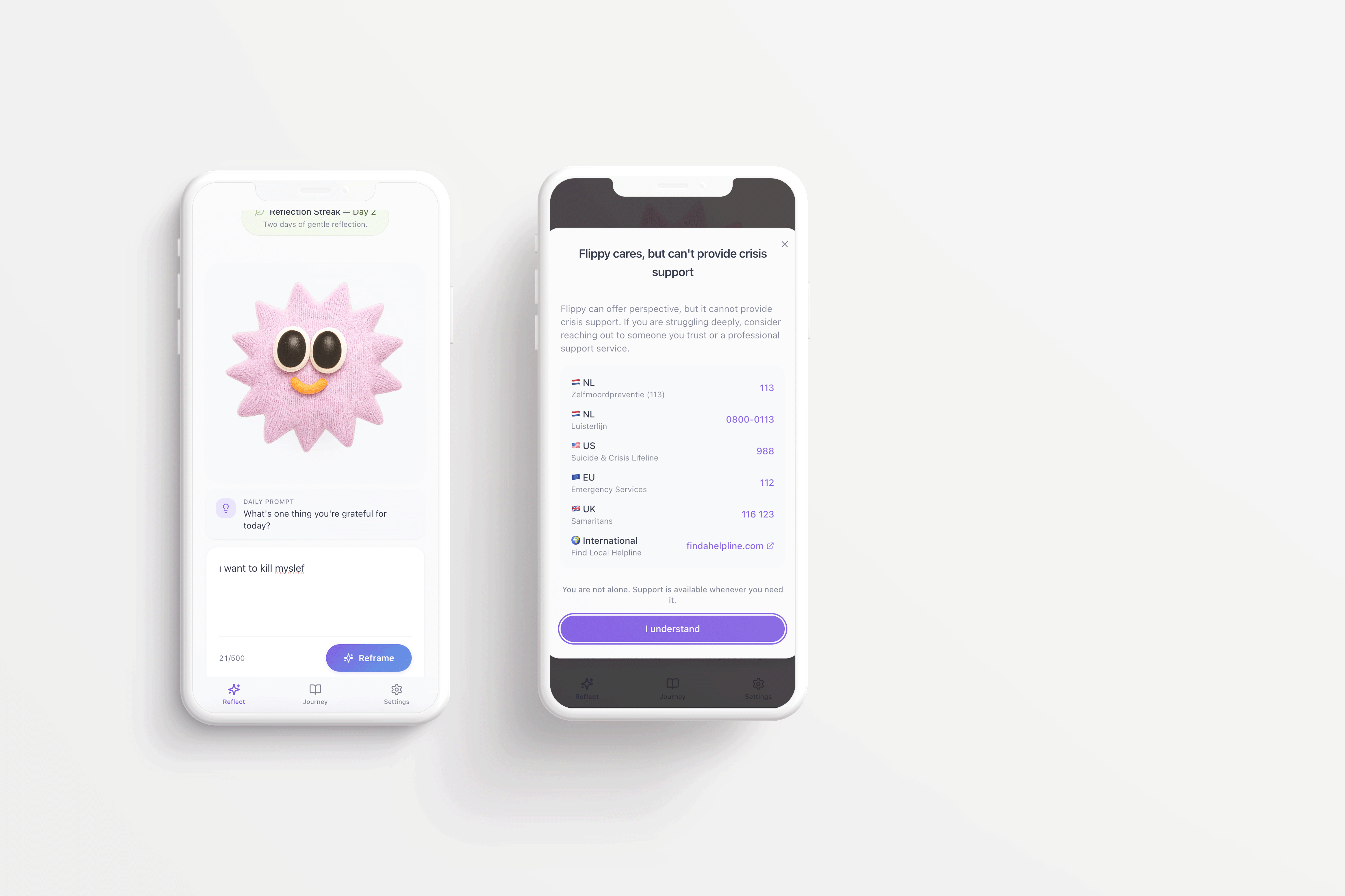
This became one of the most important lessons of the project: even a small AI product carries responsibility as soon as people begin using it in real emotional contexts.
Monitoring over time
Responsible AI design does not end when a product works once.
Even if a system behaves as intended today, model updates, infrastructure changes, or prompt adjustments can affect how responses are generated over time. Because of this, Flippy would require continued review to make sure the system remains supportive, non-judgmental, and aligned with its original purpose.
Monitoring would focus less on feature growth and more on behavioural consistency: whether responses stay within scope, whether tone remains appropriate, whether edge cases are handled carefully, and whether the system continues to reflect the principles it was designed around.
In that sense, governance is not something added after the fact. It is part of maintaining the product responsibly as it evolves.
Reflection
Flippy started as a playful vibecoding experiment — a fast way to explore what could be built with AI-assisted development tools. But the moment people could type real thoughts into the interface, the project changed.
The question was no longer only how to make the interaction work. It became how to make it behave responsibly.
That shift brought the real design priorities into focus: clear boundaries, careful tone, user control, privacy, and transparency. What began as a small technical experiment became a more serious exploration of how AI products can remain simple without becoming careless.
Flippy showed me that building with AI is not only about speed or experimentation. It is also about knowing when to narrow a product, when to step back, and how to make responsibility visible in the experience itself.
Future product direction
As the concept matured, Flippy evolved from a single reframing interaction into a lightweight reflection product with a clearer long-term direction. The experience expanded into a small journaling flow where users can save reflections, revisit them later, and notice small changes in how they interpret situations over time.
The interface follows calm, familiar patterns from wellness products, but keeps transparency and control close to the interaction itself. The aim is not to build a large emotional platform. It is to keep Flippy intentionally small: a gentle tool that helps someone pause, reframe a thought, and continue with a slightly different perspective.
Meet Flippy
