

agi@hiskot.com
Skót © 2022
ING Senior Assist
2025
role: Solo UX Researcher & AI Product Designer
Not everything needs AI. At the service desk, I saw hesitation that analytics would never capture. The interface worked. But people still paused. This project explores how design — not automation — can restore confidence. Decision Logic vs. AI
At a glance
Challenge: Older users can still hesitate in sensitive payment flows, even when the interface itself is technically clear.
My role: Solo UX researcher and designer. I shaped the interaction design, decision logic, AI boundaries, and prototype logic behind the concept.
Research: Based on my experience at the ING service desk, I observed that hesitation was often driven less by inability than by uncertainty. Many older users were not looking for speed, but for reassurance before completing sensitive tasks.
What I explored: How service-like guidance, deterministic flow logic, voice support, and carefully bounded AI could make high-risk banking moments feel calmer and more predictable.
Why it matters: Emotional design is not only about empathy. In sensitive banking flows, reassurance can also affect support load, efficiency, and customer independence.
UX methods & deliverables: User journey mapping · Task flow design · Interaction-state model · AI boundary mapping · Figma prototype · Usability testing plan
How I approached the project
I translated real service-point observations into a guided banking flow for older users. The work focused on identifying moments of hesitation, mapping the payment journey, defining predictable interaction states, and prototyping a calm step-by-step experience in Figma.Because this was a concept project, I did not run a full usability test. I included a usability testing plan to show how the flow could be evaluated around clarity, reassurance, and user control.
Designing confidence in high-risk digital banking
Digital banking is fast.
But money is emotional.
During three years working at the ING service desk, I supported customers — many of them seniors — who were not struggling with intelligence, but with uncertainty. High-risk actions such as making payments triggered hesitation, repeated verification, and visible anxiety. The interface was not unusable. It felt unsafe. ING Senior Assist explores whether digital banking can feel as calm and supportive as being guided by a service desk representative — specifically for senior users who experience uncertainty in high-risk financial moments.
The Core Question
Should critical financial flows rely on adaptive AI personalization —
or on deterministic, predictable system behavior?
Rather than adding more intelligence, the design challenge became:
When should intelligence step back?
The goal was not to make the system feel smarter.
It was to make it feel steadier.
In high-risk financial moments, reassurance depends less on adaptation than on visible consistency. A system that changes too much may feel efficient from a technical perspective, but unstable from a human one. This project began from that tension. It asked whether confidence could be designed through guidance, pacing, and confirmation — while keeping the critical flow itself predictable.
What I Observed
Working directly with customers revealed something analytics cannot show: hesitation.
Not confusion.
Not inability.
Hesitation.
Some users read every word before tapping.
Some verified amounts three or four times.
Most of them only felt confident continuing once the steps were clearly guided and the right buttons were pointed out after they explained what they wanted to do.
The interface was functioning correctly.
But many users still paused.
They weren’t looking for speed.
They were looking for reassurance. In high-risk financial moments, they needed visible confirmation — that the amount was correct, the account was correct, and nothing would happen without their clear intent. More than anything, they needed the steady guidance a service desk representative provides.
Over time, patterns emerged:
• Hesitant but compliant
• Anxious and verification-seeking
• Confident but easily derailed

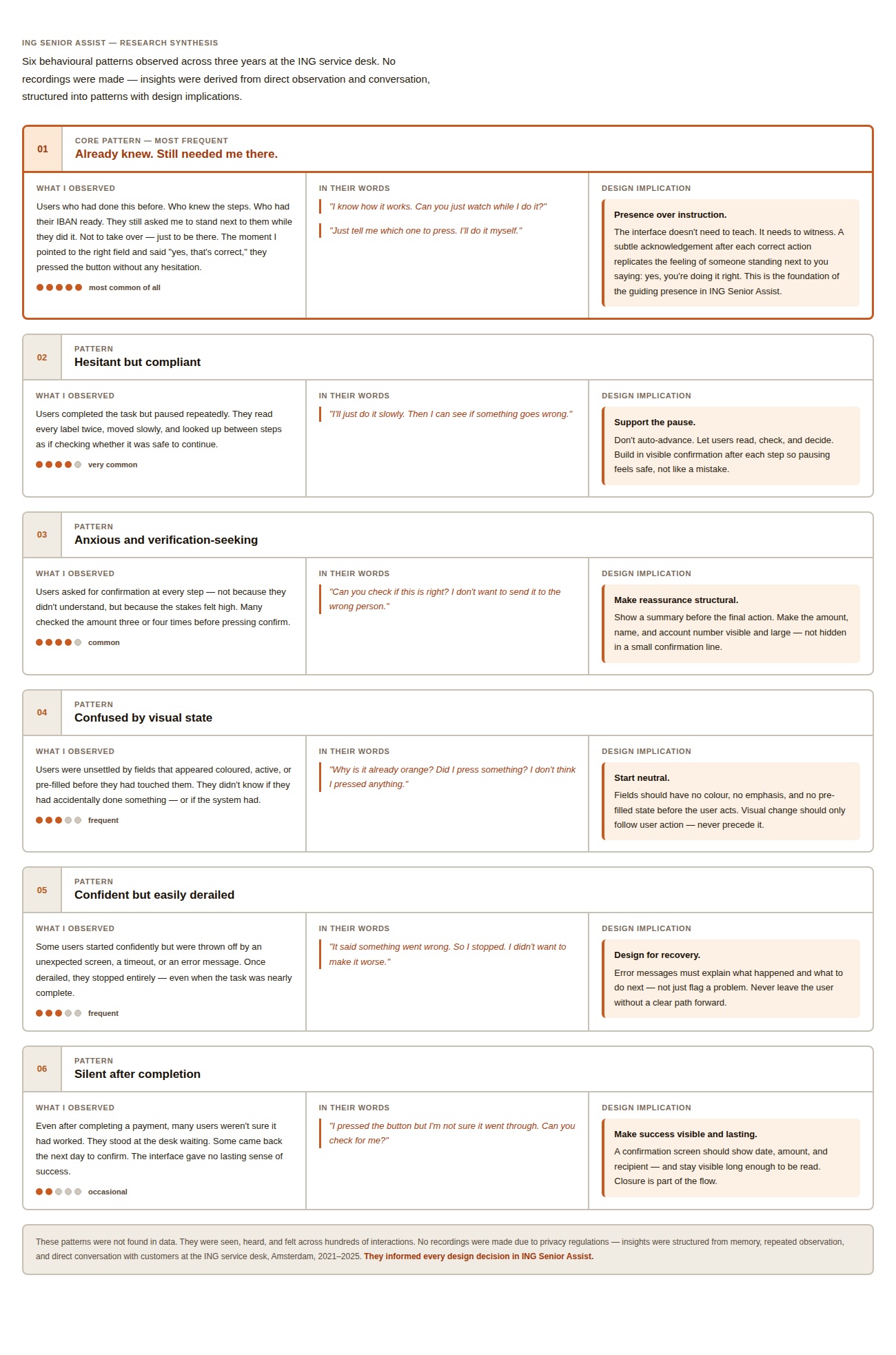
These patterns did not point toward a lack of ability.
They pointed toward a mismatch between what the interface provided and what the moment required.
The existing flows were built for completion.
What these users often needed was confirmation.
What I designed: Voice first. Never voice only.
I owned the concept and interaction design end to end—from identifying the user problem to defining the flow logic, interface behaviour, and prototype.
Rather than adding voice to a single payment screen, I designed a reusable, multimodal interaction system for sensitive banking tasks. Users can speak, tap, read, or listen—and switch between them without losing progress.
Every spoken prompt is also visible. Important information is shown and repeated back. Nothing moves forward without explicit confirmation.
Accessibility is not one simplified interface. It is the freedom to choose how to interact while the system remains consistent, understandable, and safe.
Design decisions
Every design decision was grounded in observed behaviour, not assumption.
In this flow, reassurance mattered more than speed.
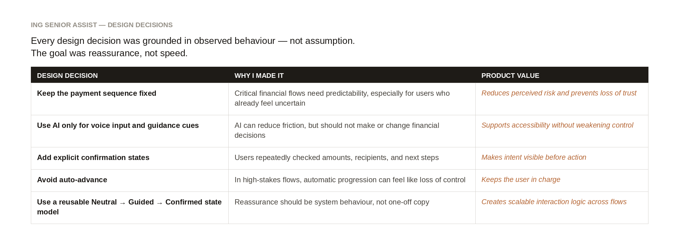
This helped turn the concept from a screen-level redesign into a more structured interaction model. The goal was not to make the flow feel faster, but to make each step feel understandable, predictable, and safe.
Research Approach
This project is grounded in field exposure.
Over three years at the service desk, I supported real customers navigating real financial actions. Due to privacy regulations, no customer data was recorded or stored. Insights were derived from behavioral observation and direct conversation. This was complemented by heuristic evaluation of existing payment flows, informal interviews about emotional experience, and simulation experiments in Google Colab. The goal of the simulation was not to optimize prediction. It was to evaluate predictability.
This distinction mattered.
The question was not whether the system could become better at guessing what a user might need next. The question was whether that kind of adaptive behavior would make high-risk moments feel less stable. In this context, perceived consistency was more important than optimization.
Why AI can help — and where it should stop
AI is useful in this concept, but only in carefully bounded ways.
It can help understand spoken input, reduce friction for users who find typing or navigation stressful, and support a more natural interaction in moments where reassurance matters. It can also support guidance cues and contextual reassurance — not by changing the flow, but by helping the system respond in a way that feels attentive, calm, and easy to follow. This is where AI adds value: not by taking control, but by making support more accessible inside the flow itself.
That also made the boundary clear.
AI should not reorder the critical flow.
It should not auto-advance steps.
It should not make payment decisions.
And it should not adapt confirmation logic in ways that reduce predictability.
In this concept, AI assists.
It does not decide.
That boundary was important to me because it reflects how I think about AI in product design. The question is not only what AI can do. The question is where its flexibility supports trust, and where that same flexibility starts to undermine it.
Transferable principle for financial AI
The AI layer was designed to support the user, not act on their behalf. It could help with input, guidance, and checking, but the final decision stayed visible and explicit.
This same principle could apply to other financial tasks such as invoice preparation, account changes, or categorisation: AI can reduce effort, but it should not reduce user control.
Testing with synthetic data
Because real customer data could not be used, I created synthetic behavioural profiles and translated them into testable variables in Google Colab. I compared predictable, rule-based flow logic with probabilistic machine-learning behaviour across step order, confirmation, and visual emphasis. The experiment was not intended to predict real customer behaviour or replace user testing. It gave me a privacy-safe way to explore product logic, question whether AI-driven adaptation was appropriate, and make more deliberate design decisions when access to real data was restricted.

Decision Logic vs. Machine Learning
Machine learning can optimize flows.
It can reduce friction.
It can personalize.
But it also introduces variation.
In a payment context, variation becomes uncertainty.
For digitally confident users, adaptive shifts may feel efficient.
For anxious users in high-risk moments, they feel unstable.
In regulated banking environments, explainability matters.
Predictability matters more than personalization.
The decision was deliberate:
• Critical payment steps use deterministic, human-designed decision logic
• AI is limited to supportive roles — voice interaction, guidance cues, contextual reassurance
AI assists.
It does not decide.
The payment logic remains fixed.
The sequence remains fixed.
The confirmations remain fixed.
AI is present only where it can support the user without destabilizing the flow. It helps interpret spoken input. It supports guidance. But it does not change the structure of the system underneath. In a context where trust is tied to consistency, restraint became a design decision.
Why a Separate Experience
Many accessibility improvements benefit everyone.
ING Senior Assist explores a different approach: intentional segmentation.
The slower pacing, repeated confirmations, and persistent visual guidance are designed for users who value reassurance over speed.
For users who prioritise speed and efficiency, this experience would feel slow.
Creating a dedicated flow allows both groups to receive an interface aligned with their expectations without compromising either. This is not simplification. It is intentional pacing.
The design does not try to create one ideal experience for everyone.
Instead, it acknowledges that different users can need different kinds of support in the same task. What feels smooth to one person can feel rushed to another. A separate experience made it possible to treat reassurance as a primary design goal, rather than as a secondary layer added to a speed-first flow.
A short prototype shows how reassurance, confirmation, and voice-supported input work together in the payment flow
Task flow focus
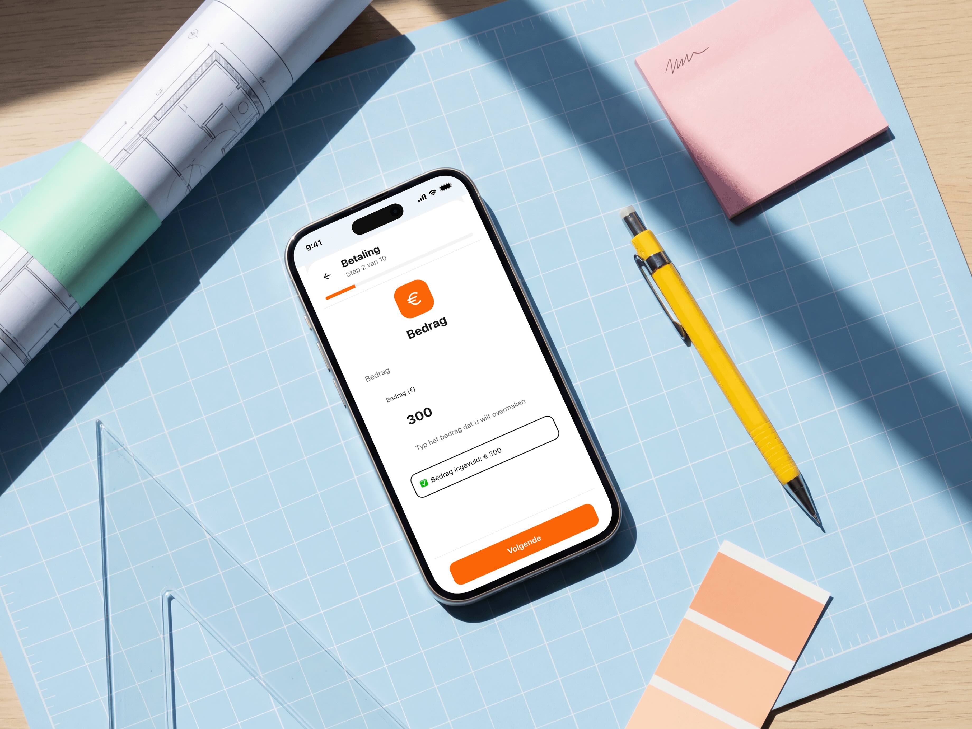
I used the payment flow as a representative high-stakes task to explore how guidance, pacing, confirmation, and user control could work across the wider banking experience.The goal was not to redesign only one payment screen, but to define a repeatable interaction pattern for sensitive banking flows where users need clarity before moving forward.
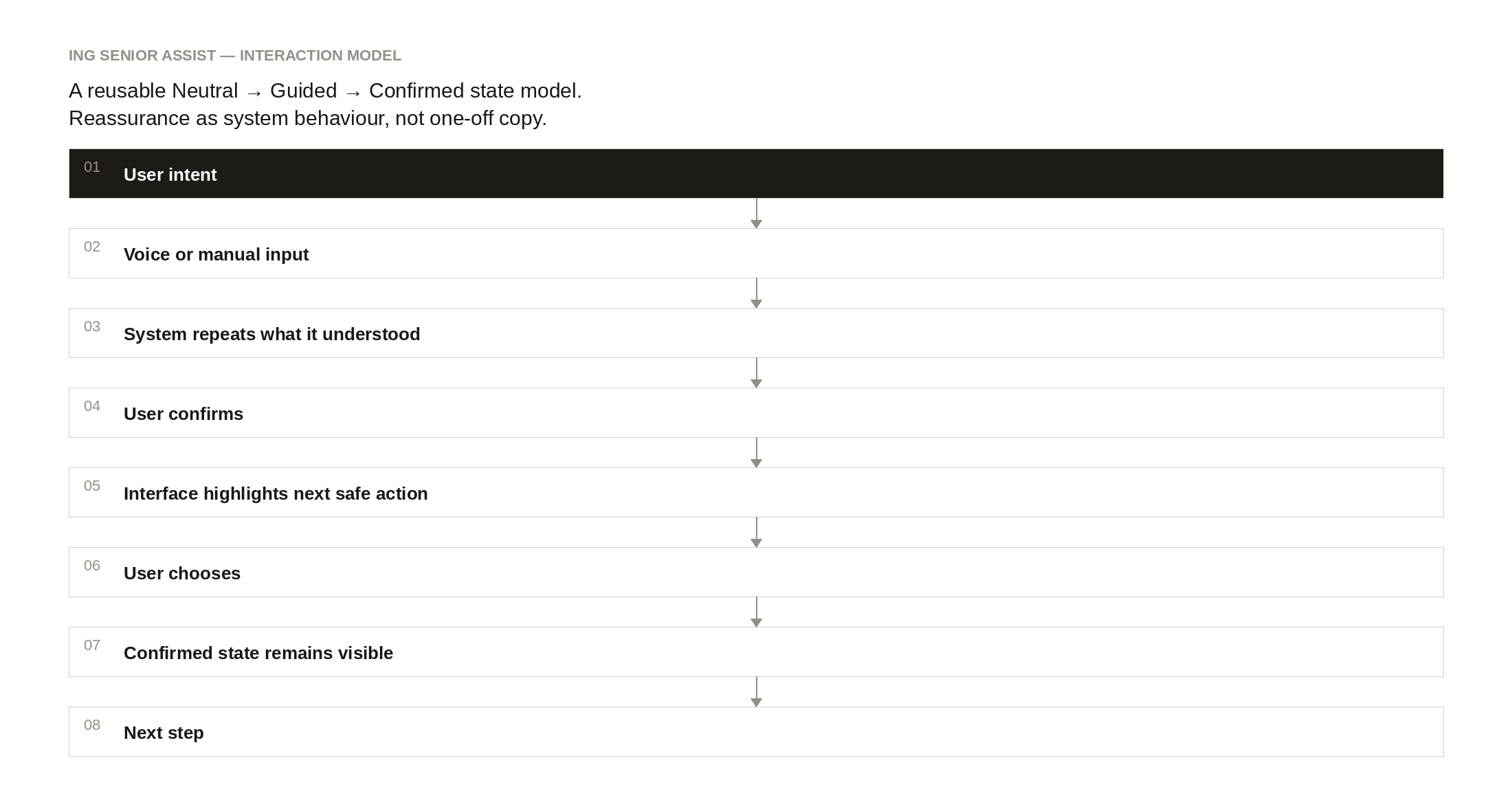
Interaction-state model: Neutral → Guided → Confirmed
To make reassurance repeatable, I defined a simple interaction model: Neutral → Guided → Confirmed.
The model describes how the system behaves during sensitive financial actions: it listens, repeats back what it understood, waits for explicit confirmation, highlights only the next safe action, and keeps the confirmed state visible.
The interface is inspired by the physical service desk.
At a bank branch:
• The representative points to what comes next
• They wait
• They confirm before proceeding
• They do not act without explicit consent
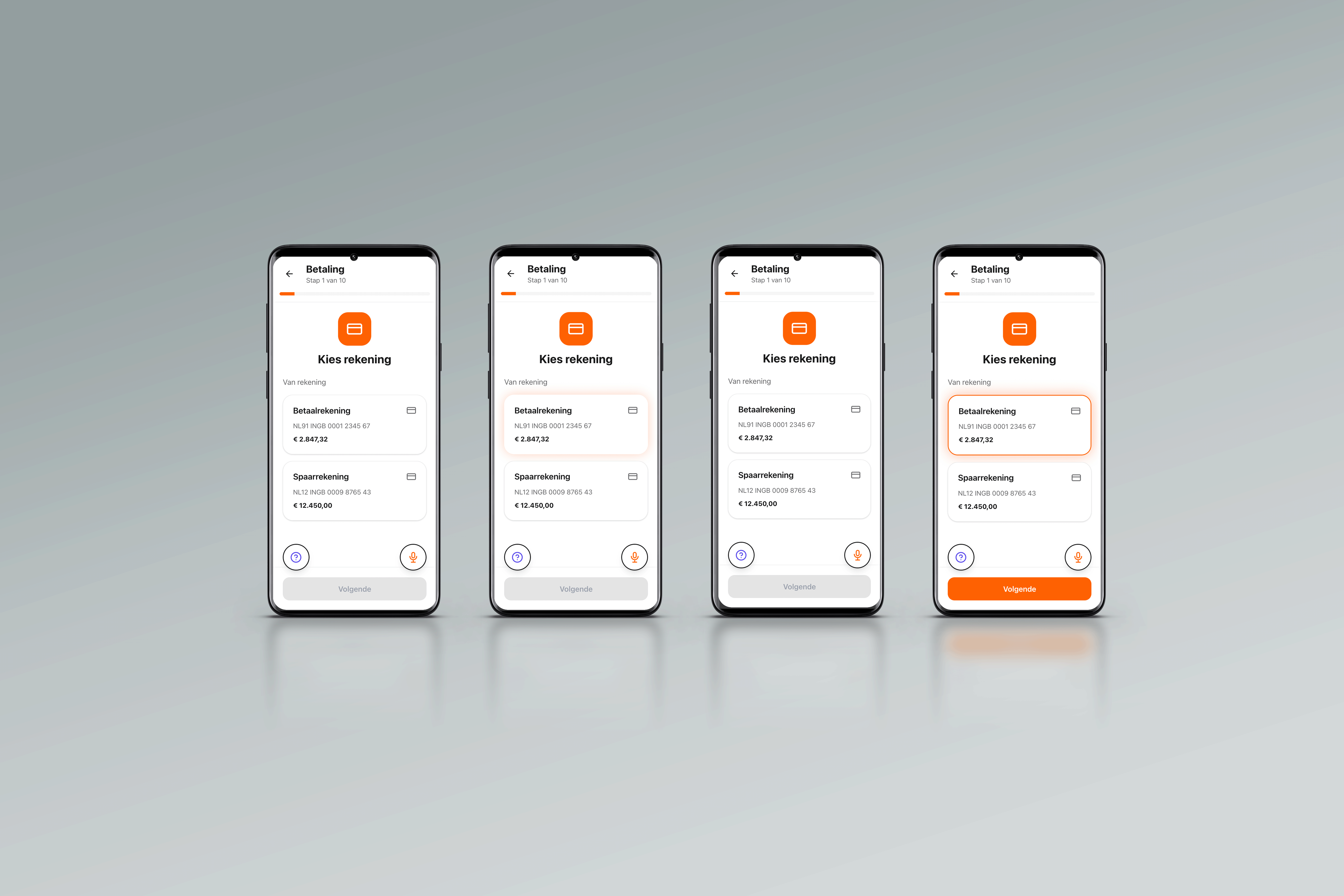
The digital flow mirrors this behavior:
• Buttons begin neutral
• After a short delay, the next step is softly highlighted
• When selected, the choice remains visibly confirmed
• Nothing progresses automatically
The system does not rush.
It reassures.
Rather than pushing the user through the flow, the interface behaves more like a steady presence. It shows where attention is needed, waits for action, and makes the result of that action visible. The aim was not to create a more animated interface, but a more trustworthy one.
This is not animation.
This is a conversation. After the user speaks their choice, the interface waits, points, and confirms — the way a person at the service desk would.
A guiding presence, built into the system
Rather than simplifying the interface further, I designed a guiding presence inspired by the support people receive at a service desk.
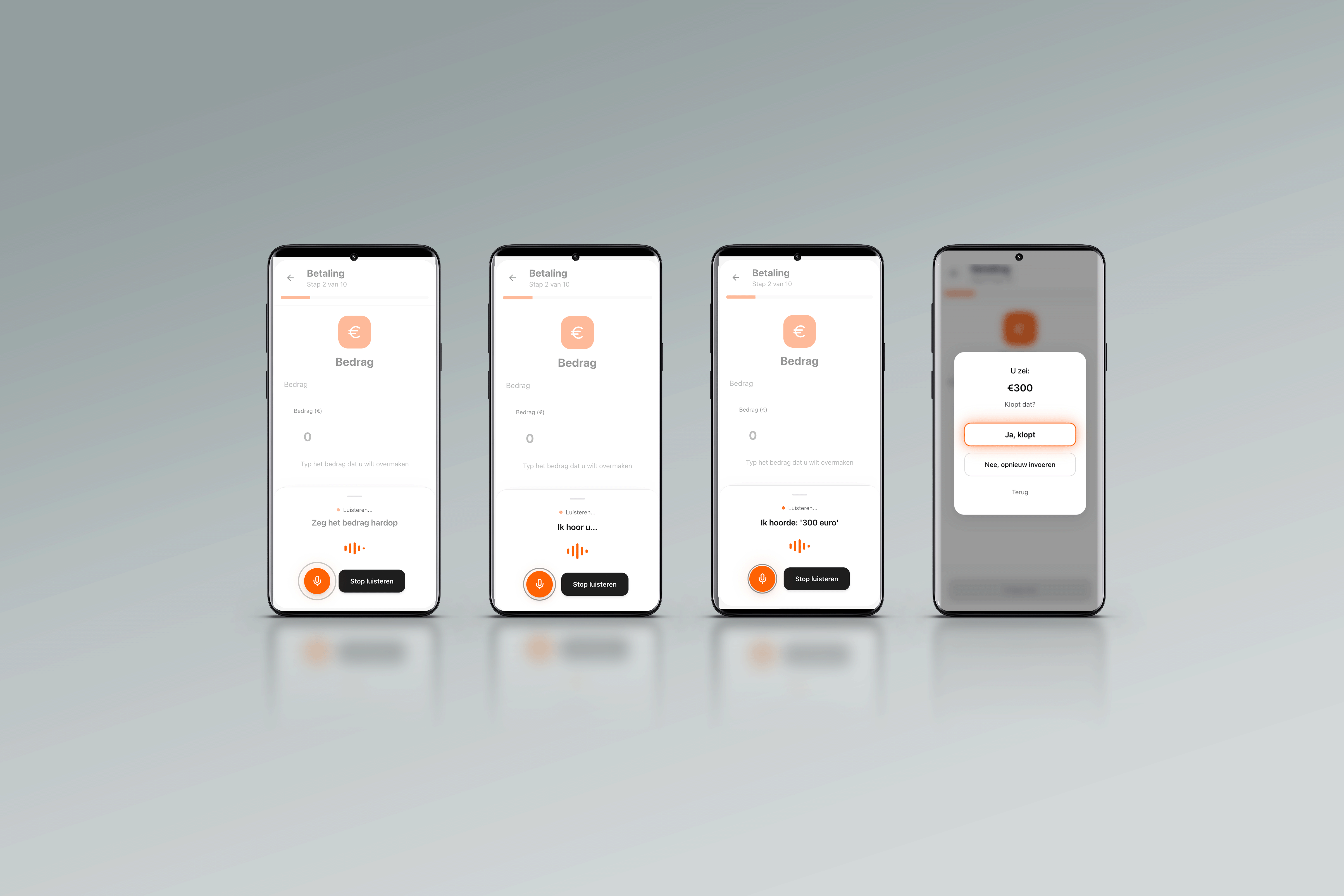
The system prompts, listens, guides, confirms, and waits:
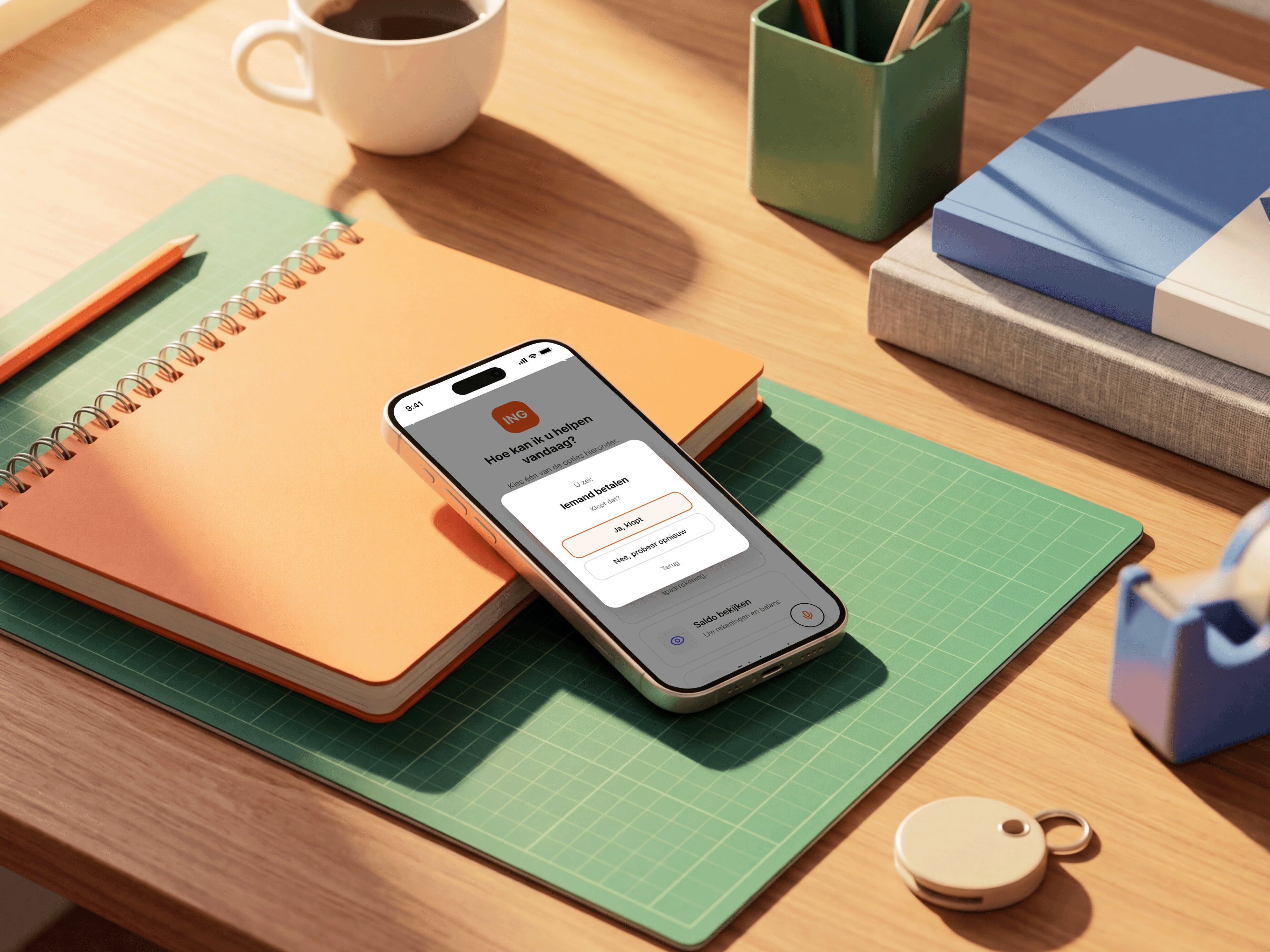
“Voor wie is de betaling?”
“Welk bedrag wilt u overmaken?”
“U wilt €300 overmaken. Klopt dat?”
Voice creates a natural starting point, but it is never the only way to interact. Every spoken prompt is also visible, and every action can be completed by voice or touch.
AI interprets the spoken input. The interface then uses a soft orange glow to guide attention towards the next safe action. Once the user makes a choice, the glow becomes a persistent outline and the information is repeated back for confirmation.
These cues follow the same Neutral → Guided → Confirmed pattern throughout the experience. The sequence does not change between screens or interaction methods, and nothing progresses automatically.
Reassurance is therefore not added through extra messaging. It is embedded into the behaviour of the system: one consistent language of guidance across the experience.
Voice in. Guidance out. Confirmation before action.
Trade-offs
This experience is slower.
It requires explicit confirmation steps.
It does not auto-optimize for speed.
But in financial contexts, speed is not the primary KPI.
Trust is.
Limiting machine learning in critical flows reduces automation potential, but increases explainability and perceived safety.
That trade-off is intentional.
The concept gives up some efficiency in order to preserve confidence.
That was not a compromise made reluctantly.
It was the point.
A system that feels slightly slower, but easier to trust, may ultimately support more independent use than a system that is optimized for speed but experienced as uncertain.
Validation plan
Because this was a concept project, I did not run a full usability test. The next step would be to test whether older users understand each step, feel in control, and can complete the payment flow without needing extra reassurance from a service representative.
Example test tasks
• Start a payment using voice-supported guidance
• Confirm the recipient and amount
• Explain what will happen before pressing the final confirmation button
• Identify whether the system is guiding, confirming, or waiting for user input
Success indicators
• Users understand what is happening at each step
• Users feel guided without feeling pushed forward
• Fewer moments of hesitation or repeated checking
• Clear understanding of the final confirmation step
• Users can explain what the system will and will not do
What i would measure
• Task completion without staff intervention
• Number of repeated checks before final confirmation
• Time spent on the confirmation step
• Self-reported confidence before and after the flow
• User ability to explain what the system will do next
• Support questions around “what should I press?” or “is this correct?”
Design outcome and business hypothesis
ING Senior Assist turned recurring service-desk observations into a complete interaction concept.
The outcome is not simply a redesigned payment screen. It is a reusable, multimodal system for sensitive banking tasks. It combines a voice-first flow with touch and visual alternatives, a repeatable Neutral → Guided → Confirmed interaction model, visible confirmation before consequential actions, clear boundaries between AI assistance and fixed payment logic, and a high-fidelity prototype with a validation plan.
Because the concept has not been deployed, I cannot claim that it has already reduced support contacts or operational costs.
The business hypothesis is testable: if predictable guidance helps more customers complete sensitive tasks independently, reassurance-driven support interactions may decrease while customer confidence increases.
A pilot could measure task completion without staff assistance, repeated checks before final confirmation, errors and abandoned flows, confidence before and after the task, and reassurance-related questions such as “What should I press?” or “Did I do this correctly?”
Reflection
Designing for aging is not about larger fonts alone.
It is about mental models formed in different technological eras.
Many older adults grew up with mechanical interfaces where controls were visible and fixed. Modern layered digital systems require navigation, abstraction, and adaptation.
When interfaces change silently, trust erodes.
Every generation eventually becomes unfamiliar with new technology.
Designing for predictability today is designing for everyone’s future self.
This project changed the way I think about intelligence in product design.
Not every problem asks for more adaptation.
Sometimes the better question is how to make the system clearer, steadier, and easier to trust.
Prototyping & AI Use
This prototype was built in Figma Make, with AI used as a thinking partner during iteration. ChatGPT helped test interaction logic and refine timing patterns, particularly around guidance and confirmation states. All explorations were based on synthetic behavioral assumptions. No internal banking data or customer information was used.
AI assisted the work.
The decisions were mine.